Dashlane UX Writing Portfolio
Invite link.

role
UX Writer
UI copy, UX flow, naming, web copy, transactional email
Goal
Make it easier for admins to invite employees and for employees to sign up
problems & opportunities
Admins have no control over the automatic invite email Dashlane sends when they provision users and want to invite employees directly.
Provisioned users never see the invite email or think it’s spam; Over a six-month period in 2022, 45% of invited employees never logged in to Dashlane.
the process
Validate technical possibilities
One challenge in encouraging employees to sign up to Dashlane is building trust. The Product Designer and I proposed including the team name on the sign-up page so the invited user would recognize their organization and be more likely to create their account. Engineers validated this as technically feasible, and security signed off on including this data on the page.
Describe the feature to admins and employees
It was important to clarify to admins that only provisioned users can sign up through the invite link.
To follow inclusive language best practices, we don’t use “enable/disable” terminology and instead usually use “turn on/turn off.” However, “turning on” a link did not feel like natural language. I decided on the alternate, “activate/deactivate,” which also felt like a good match with the action being taken.
When describing the feature to invited users, I made the decision to focus more on the sign-up page experience (as you can see in the error) because that is the primary way they interact with the feature.
Choose a name
There was a large discussion internally about what to call this feature. Initially, I believed “sign-up page” was more accurate to what the value of the feature was to the end user. However, following more competitive research and strategic reframing at the company level that admins were our primary customer, we landed on “invite link.”
Address security requirements and adjust for engineering constraints
While designing the employee flow, we learned that a verification flow needed to be included for security reasons. Initially, the Product Designer and I designed a flow that included a verification code. The idea was that it could be adapted for other sign-up scenarios that might need a verification flow. However, there was a lack of server engineers available to do the backend work for a new flow. Partnering with the available engineers on the team, we came up with the solution to resend a variation of the original invite email and clicking the button in the email would serve as verification.
Tweak the existing invite email
I proposed updating copy that said “email invite” to “invite email” to align with “invite link.” After buy-in from necessary stakeholders, I updated the existing keys throughout the product.
The verification flow we introduced included touchpoints that could apply to more than just users signing up with the invite link. I had to ensure that the language was general enough to apply to several situations and align the original invite email to include verification language.
Additional error message
During internal QA testing, we realized a scenario we hadn’t initially accounted for: if an invited user clicks on the invite link after an admin has deactivated it. Given this is not something Dashlane can solve for the user, I needed to direct them to contact their plan admin. I also included the more general language “IT team” since the user may not know who their plan admin is.
〰️〰️〰️
〰️〰️
〰️〰️〰️ 〰️〰️
Device limit paywall.

Role
UX Writer
UI copy, value prop inclusion, CTAs
Goal
Improve the performance of the device sync limit paywall and
problems & opportunities
Free users encounter friction when they want to use Dashlane on more than one device
The device sync limit paywall is the lowest performing paywall despite users who encounter it being strong contenders to upgrade
the process
Competitive research
The team’s Product Designer and I took a look at products with similar paywalls including other password managers and also software in other fields, such as Evernote and Dropbox. We evaluated messaging, limitations, and dark patterns (to know what not to do).
Framing value props and advocating for the user
As an advocate for the user, it is my job to consider their needs alongside business goals. For interested users, upgrading would remove friction because they would no longer need to unlink a device and transfer their data each time they wanted to use Dashlane somewhere else. It was important to concisely highlight the value props of a paid plan, leading with this value. Additionally, it was important to allow users who want to stay on Free to transfer their data with reassurance and not introduce any dark patterns in the UX.
Crafting CTAs
Confirm & unlink: One of Dashlane’s UX Writing guidelines is to, wherever possible, link the primary CTA to the title. (A good rule of thumb is to read just the title and CTA together without any body copy and see if you can understand the experience). So while it’s best practice to keep CTAs simple and short, in this case, it was most accurate and clarifying to include both the actions the user would be taking.
Get unlimited access: I made the decision to change the CTA in the confirmation modal from leading with “upgrade” to leading with the value prop to help encourage upgrading.
Reassurance for those transferring data
Personal data is a sensitive thing. During the transfer process, it was important to reinforce to the user in the copy that Dashlane was transferring their data securely and there was nothing for them to worry about.
The new, optimized paywall includes a secondary upgrade CTA. The user can still cancel the process by selecting the back arrow.
To test or not to test?
While we often test UX and UI changes on the monetization team (in case any updates negatively affect business results), the team had high confidence that these updates would at the very least have a neutral effect on the business and, best-case, have a positive business impact.
key results
📈 In the first month, conversion rate increased by 9.9%.
💵 This is expected to yield an increase of at least $130K in ARR.
💡 The team is taking a closer look at existing paywalls, including VPN and Dark Web Monitoring and is in the process of introducing a new, standardized paywall model.
〰️〰️〰️
〰️〰️
〰️〰️〰️ 〰️〰️
Data import.

Role
UX Writer
UI copy, user flows, error handling, instructional content, information architecture, iterative improvements
Goal
Improve the import experience for users with better guidance and education
Problems & Opportunities
30% of new B2B users need to import their logins, but the success rate is only 50%
Users have no control over their items before finalizing import, which can lead to a frustrating, messy experience if items are imported incorrectly
the process
Work alongside engineers
Because so much of the import feature’s UX relies on technical capabilities (such as what data we can reliably parse), it was incredibly important to be in lockstep with the team’s engineers. The Product Designer and I had regular check-ins with the engineers, adjusting and refining the flow as necessary.
Decide on the number of steps
The previous import experience had one step. If it failed, users weren’t given adequate reason why. Even the success state could still be a problem if items weren’t imported correctly, creating a mess in the user’s vault. By adding more guidance and a preview step, we are helping to mitigate many user problems. At the early stages of this project, the team spent time discussing how we might combine or split steps for the most intuitive experience possible, given various technical limitations.
Set expectations for the user
Throughout the import process there are various limitations, including what actions users are able to take. One content challenge was concisely explaining these limitations to users in the correct context.
Make technical concepts accessible
Dashlane is an extremely technical product, but that doesn’t mean we always need to use technical language. We want to make our product as accessible to as many folks wherever we can. To that end, “unlock” felt like more accessible and friendlier language than the term “decrypt.”
Elevate an engineer’s proof of concept
After releasing the initial revamp of the feature, one of the team’s engineers developed a proof of concept that would allow a user to import their data directly from LastPass without having to download the data in a CSV. The team wanted to release it quickly because of the potential business impact, but it needed some UX love before that could happen. The Product Designer and I partnered to quickly iterate on the original proof of concept
Prioritize improvements with the team’s Product Manager
As feedback began to roll in on both the CSV import flow and the LastPass flow, the Product Designer and I worked closely with the team’s Product Manager and Engineering Manager to prioritize which improvements to tackle first.
“The switch to Dashlane was effortless, I just imported from LastPass and Bob’s your uncle.”
sneak preview
A future version of the preview table
During the original design period, I was largely responsible for the content hierarchy of the preview table and the instructions for that step. I took the opportunity to think of an ideal state as well as the MVP, and this included mocking a future version of the table where a user can edit both headers and individual items.
key results
📈 Increased CSV import success rate from ~50% to ~90%.
🤝 Help the 10x increase in LastPass users migrating to Dashlane (after LastPass’ breach)
〰️〰️〰️
〰️〰️
〰️〰️〰️ 〰️〰️
Self-serve: Buy seats with CC.

Role
UX Writer
UI copy, user flows, user testing
Goal
Empower invoice-based admins to easily add more seats on their own
Problems & Opportunities
Invoice-based admins can’t purchase seats on a one-off basis without contacting Support or their Sales rep
This friction is annoying for them and a potential loss of revenue for the company
the process
Confirm scope
Unfortunately it wasn’t in scope to update the design or hierarchy on the account summary page (which we all agreed needed some work). Given that, we predicted we might have a challenge bridging the gap between multiple payment methods and the action of buying seats since the “Buy more seats” CTA was located away from the billing information.
Clearly describe payment methods
I worked through several copy iterations knowing that we couldn’t improve the layout or content hierarchy on the entire account summary page. The goal was making the differences between the payment methods as clear as possible, while keeping the copy concise.
Set expectations for the admin
Throughout this flow, we wanted to make sure the admin clearly understood the implications of each action. This largely came down to providing clear, straightforward copy. For example, clarifying in the choose payment modal that if they select invoice they’ll be redirected.
While designing the flow, the Product Designer and I identified an opportunity on the success page to encourage Business plan admins to use their newly purchased seats; I also recognized that it would be a good moment to remind admins that when they invite new plan members, the free Friends & Family offer is automatically sent.
Test, learn, and adjust
The Product Designer and I collaborated on usability testing to make sure the idea of a secondary payment method was understood. There were two main outcomes:
I proposed simplifying the flow and combining two modals into the current payment method modal to reduce clicks.
I adjusted the descriptive copy to what you see in these screens; initially the payment methods were described as “Primary” and “Secondary” but during testing, it became obvious this was not clear enough to admins. So, while the new subheads are longer, they are clearer.
〰️〰️〰️
〰️〰️
〰️〰️〰️ 〰️〰️
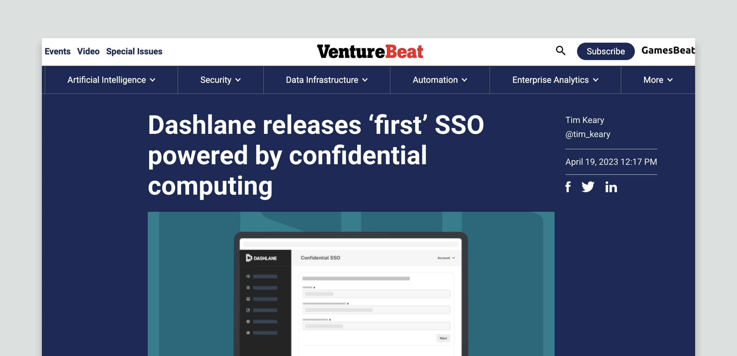
Confidential SSO.

role
UX Writer
UI copy, instructions, error handling, microcopy
Goal
Provide a simple solution so business admins can easily set up SSO with Dashlane. On the business side, reduce the number of deals lost because admins have to host the encryption service themselves.
Problems & Opportunities
Only 20% of our Dashlane Business admins have SSO activated, and the Sales team estimated that this number could be increased to ~50% with Confidential SSO
There is a massive point of friction caused by the need for admins to have and host an encryption service themselves
Admins don’t understand the value of the encryption service: providing an unparalleled level of security in Dashlane’s SSO integration
The process
Discover the main pain points
Partnering with various stakeholders, we gathered commonly-heard pain points from our customers. That way, as we headed into design, we knew that we were solving the direct concerns of our customers and not our own assumptions.
Work alongside engineers in a progressive rollout
Because Confidential SSO uses a relatively new technology, engineers were discovering limitations alongside the Product Designer and I designing the user experience. We had to consistently adjust to account for new information and be open to scope changes. From a UI writing perspective, this meant me being very collaborative and communicative with our engineers to ensure my content was accurate.
Simplify complex content
While most admins who want to use SSO are likely on the more technical side, it was still important to ensure copy was clear and easy to understand given the many technical aspects of this feature. Additionally, one of the challenges was providing clear guidance when what the admin needed to do could vary based on their identity provider (IdP).
Increase efficiency in steps
As we worked through rolling improvements, I identified areas where we may be able to combine steps, reduce copy (without losing clarity), and lessen the cognitive load for the admin.
Set expectations
It was important to clearly explain the implications of certain actions, including:
Confidential SSO doesn’t support SCIM provisioning and admins can’t switch between configurations. We needed to explain and emphasize this information before an admin activates one or the other.
Once SSO is active, we wanted to alert admins that it will also be active for any new domains they verify. Since admins can’t deactivate SSO on their own, it was important to set expectations about what will happen after activating it.
Handle various error states
Partnering with the engineers on the team, I worked through identifying and addressing error states. One particular challenge for this project is many errors can occur outside of the Dashlane product, and we have to do our best to guide the admin on how to handle issues we can’t fix. Additionally, during the early release period I identified an opportunity to avoid an error by blocking an admin from deleting a domain while SSO is active (which otherwise would block all end users from accessing Dashlane).
“The deployment experience was seamless, allowing us to get our customer up and running quickly AND made it very scalable for our team to do with other customers.”
〰️〰️〰️
〰️〰️
〰️〰️〰️ 〰️〰️
Admin onboarding.

Role
UX Writer
UI copy, UX flow, education
Goal
Simplify onboarding for admins, engage them with key features, and excite them to roll Dashlane out to their org
Problems & Opportunities
In the current experience, when admins lande in TAC, they see three red alerts and no guidance about what steps to take next.
Switching between the Admin Console and the vault is confusing and disrupts onboarding.
24.1% of leads who install extension converted vs. 6.5% of leads who didn’t install extension
Only 38% of leads come back to TAC by the end of the trial period but 61% go back to the vault
Every switch between TAC and the vault requires the admin to log in to Dashlane and opens in a new tab
In the web app, admins can’t see the getting started experience their plan members see in the extension
Leads are more likely to convert to a paid plan if they (and the plan members they invite) experience Dashlane’s core features.
the process
Reconcile stakeholder feedback, data, and user interviews
The admin getting started experience was an extremely cross-functional project that involved many stakeholders across most teams at the organization. Additionally, we had new data to consider and anecdotal evidence from recent user interviews (some of which I helped conduct). As the lead UX writer on the project, I was largely responsible for reconciling all this information in the task copy, the order of the tasks, and the highlighted value props. This meant writing through many versions before landing on our final deliverable.
Balance value prop with concision
Throughout the navigation improvements and getting started experience, one of the main content challenges was enticing the admin enough to take the step we recommended while not dissuading them with overwhelming copy.
Consider user vs. plan member terminology
There is historical inconsistency between when we use “user” and “plan member” in the product. Largely, the writers prefer to use plan member; however, there are still areas in the UI that don’t, including—importantly—the Users tab. I had to make sure wherever I was using each term was clear and considered.
sneak preview
This experience is in development, and the team has already started to ideate on future iterations and opportunities to address:
What is the getting started experience for secondary admins?
How might we allow the admin to mark tasks completed themselves?
How might we fold in more customized provisioning guidance (like the invite link)?
Can we introduce a dismissable guided tour?
Can we introduce a progress indicator or other “gamification” elements?
Where are there natural moments to upsell the product?
How might we better segment admins to customize which tasks they see?
Can we update the getting started experience in the vault with this framework for consistency?
What can we pre-populate to avoid empty states? “Dummy” items that admins can share?
〰️〰️〰️
〰️〰️
〰️〰️〰️ 〰️〰️
Self-serve: Upgrade plan.

Role
UX Writer
UI copy, information architecture, transactional emails
Goal
Allow admins to seamlessly upgrade during their subscription or trial by themselves
Problems & opportunities
Admins can’t easily upgrade their plan by themselves in the product.
If and when they upgrade, the total cost of their new plan is not clear.
the process
Partner with Product Marketing
I partnered with Product Marketing to make sure we were highlighting the key features and differences between our plans. I also made sure this content aligned with the pricing page on the website (a page jointly owned by Product and Marketing that I’d previously worked on).
Decide on clear content hierarchy
One of the challenges in this project was balancing the various elements in the purchase summary, including new seats, total seats, cost per seat, updated cost, and a prorated discount for those in the middle of the subscription.
While one of the Product Designer’s original proposals had the necessary elements, I didn’t believe they were presented in the most intuitive way. I spent time looking at other examples of receipts and purchase summaries and consulted what text hierarchy styles we had before proposing a new version.
Encourage upgrades
Now that admins have the ability to upgrade in the product, it gave us the opportunity to include calls to upgrade in other areas, particularly for those in trial. I was responsible for concisely capturing the value prop of why an admin should upgrade from trial or a lower-tier plan.
〰️〰️〰️
〰️〰️
〰️〰️〰️ 〰️〰️
Naming @ Dashlane.

role
Brand writer, UX writer
Brand thinking, internal research, product taxonomy
Goal
Develop standardized naming guidelines
problems & opportunities
There are no company-wide guidelines or ownership for deciding feature names
Feature names that are decided on following the same guidelines and philosophy will help create a more consistent brand experience for users
The Director of Brand Design and I collaborated to:
Audit and map current features to get an understanding of product taxonomy and branding inconsistencies
Survey a cross-functional group of stakeholders to understand what underlying philosophy about our features already exists (but is yet to be documented)
Develop working naming guidelines that include a RACI breakdown
Start running naming workshops for features with a brief based on the guidelines